Wednesday, November 26, 2008

The Girl Effect


Or you could just give the world cable TV. At least according to this paper by Jensen and Oster.
Cable and satellite television have grown rapidly throughout the developing world. The availability of cable and satellite television exposes viewers to new information about the outside world, which may affect individual attitudes and behaviors. This paper explores the effect of the introduction of cable television on gender attitudes in rural India. Using a three-year individual-level panel dataset, we find that the introduction of cable television is associated with improvements in women's status. We find significant increases in reported autonomy, decreases in the reported acceptability of beating and decreases in reported son preference. We also find increases in female school enrollment and decreases in fertility (primarily via increased birth spacing). The effects are large, equivalent in some cases to about five years of education in the cross section, and move gender attitudes of individuals in rural areas much closer to those in urban areas. We argue that the results are not driven by pre-existing differential trends. These results have important policy implications, as India and other countries attempt to decrease bias against women.
Tuesday, November 25, 2008

Turkey Shortage?

Check out this holiday-relevant article from Slate on the market for turkeys in the US.

Thursday, November 20, 2008

Seminar: Murray

The Economics Department seminar scheduled for Friday, November 21st has been cancelled due to the illness of Professor Murray.

The details were supposed to be:

Our next seminar speaker will be Professor James Murray, Assistant Professor of Economics, Viterbo University. James is a UWL graduate (econ major). He finished his PhD at Indiana University and recently accepted a tenure track position at Viterbo University. He will present “Initial Expectations in New Keynesian Models with Learning,” on Friday, November 21st, at 3:30 p.m. in room 230. The paper can be accessed at http://www.murraylax.org/research/murray_initexp.pdf. Please invite your upper division students. I look forward to seeing you at the seminar.

Wednesday, November 19, 2008

Mitt Romney: Let them eat cake!

Romney goes on the record to let the big automakers go down. What are your thoughts? Are the externalities of their collective failure large enough to bail them out?

Wednesday, November 12, 2008

Google Flu Trends

Technology can help public health officials more quickly identify outbreaks of disease. Yesterday the NYtimes carried a story about Google tracking the geographic dispersion of the flu by tracking the origin of searches. It turns out the first thing people do before calling the doctor, is Google for "flu symptoms".
In early February, for example, the C.D.C. reported that the flu cases had recently spiked in the mid-Atlantic states. But Google says its search data show a spike in queries about flu symptoms two weeks before that report was released. Its new service at google.org/flutrends analyzes those searches as they come in, creating graphs and maps of the country that, ideally, will show where the flu is spreading.

The C.D.C. reports are slower because they rely on data collected and compiled from thousands of health care providers, labs and other sources. Some public health experts say the Google data could help accelerate the response of doctors, hospitals and public health officials to a nasty flu season, reducing the spread of the disease and, potentially, saving lives.

“The earlier the warning, the earlier prevention and control measures can be put in place, and this could prevent cases of influenza,” said Dr. Lyn Finelli, lead for surveillance at the influenza division of the C.D.C. From 5 to 20 percent of the nation’s population contracts the flu each year, she said, leading to roughly 36,000 deaths on average.

The NYTimes graphic is here and more importantly the data is here . The data would make an excellent weekly instrumental variable for certain activity.

Monday, November 10, 2008

Visualizing the Election

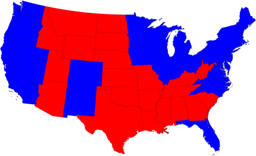
CNN and other news outlets would have you believe this is still a divided country with red states and blue states.

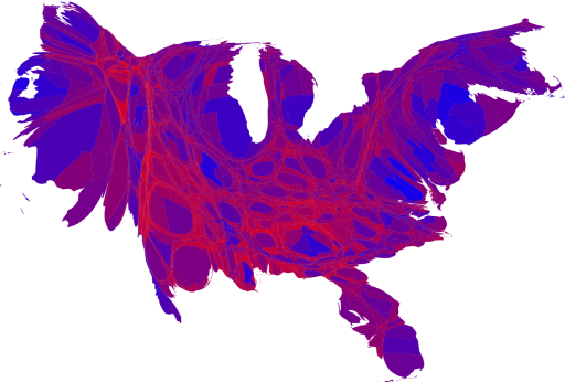
But a better visualization would shade the areas based not upon who won the state, but by the degree to which they won the state. And the states themselves shouldn't be represented as a function of their geographic size, but rather the size of their population. Here we have just such a picture, and its clear, we are all purple now. More can be found here.